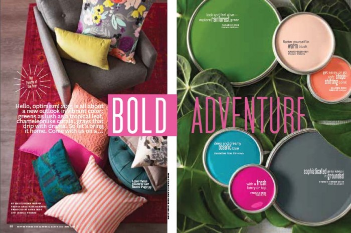
Better Homes and Gardens revealed its second annual Better Homes and Gardens® Color Palette of the Year in tandem with the magazine’s March Color Issue, hitting newsstands on February 17th. The collection of six colors highlights the most current trends in home and fashion, in hues that complement each other through multiple combinations.

“This year, we’ve built on the success of our first Color Palette of the Year to offer readers new possibilities for freshening up their homes and everyday lives,” says Gayle Butler, Editor-in-Chief, Better Homes and Gardens. “For 2015, our approach is all about optimism and a fresh outlook – adding vibrant pops of color in places where you might least expect them.”
Below is the 2015 Better Homes and Gardens® Color Palette of the Year, illustrated through paint hues from a variety of brands.
- RAINFOREST GREEN: A show-stopping jewel tone that looks and feels alive. PARADISE 6720 (SHERWIN-WILLIAMS)
- WARM BLUSH: Romantic in the home and flattering on every skin type. NAÏVE PEACH 6631 (SHERWIN-WILLIAMS)
- SHAPE-SHIFTING CORAL: Like a chameleon – sassy, yet soft. SALMON ROSE 2003-3C (VALSPAR)
(Image: BHG)
- OCEANIC BLUE: Deep and dreamy with a refreshing intensity. ESSENTIAL TEAL T15-3 (BEHR)
- FRESH BERRY: The perfect kick of color, bursting with life. PANAMA ROSE 1181-7 (PPG)
- SOPHISICATED GRAY: Dripping with drama. Rich, sexy and serene. STONE’S THROW 28-18 (PRATT & LAMBERT)
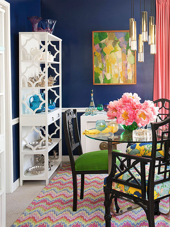
An easy way to add more color to your home is to mix the fabric on chairs. Art can also be a wonderful inspiration to pull colors. Are you excited! It’s always great to see color used in new combinations. Can’t wait to get the March Issue of Better Homes and Gardens.


 I am a wife, mother and decorator. Welcome to my blog, where I share my projects and design inspiration. I love finding vintage pieces to add character and sense of history to my designs. My other passions are family, cooking, gardening and traveling. Feel free to drop me a line or just say
